
- Development
Date
27 August, 2024
Client
Logistic Company
Category
Development
Location
New York, USA

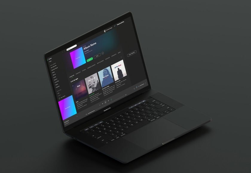
In a mobile-first world, responsive design isn't optional—it's essential. Britcode creates websites and applications that adapt seamlessly to any screen size, providing optimal viewing and interaction experiences across all devices. Our responsive designs ensure your users enjoy consistent, high-quality experiences whether they're browsing on smartphones, tablets, laptops, or desktop computers, eliminating friction and maximizing engagement at every touchpoint.
Challenge & Solution
Modern audiences use multiple devices, yet many websites still fail to deliver a consistent experience. Britcode eliminates this problem through responsive design that adapts beautifully to every screen. We begin by researching how your users interact on different devices, then design layouts that remain functional and visually appealing everywhere. With advanced frameworks, we implement responsive systems that ensure speed, accessibility, and usability.
- Research
- Concept Design
- Implementation
Our Process
We apply a mobile-first approach — wireframing, designing, and testing layouts across various devices to maintain performance and aesthetic balance. Each element is optimized for fast loading and clear readability.

Result Driven
The end result is a seamless experience across all platforms, a consistent brand presentation, and improved visitor retention. Your website becomes faster, more accessible, and more engaging for every user.
- Branding and identity
- Websites and digital platforms
- Content strategy for social media